
If you’re pouring time and money into online marketing campaigns, a high-converting landing page is your best ally. But not all landing pages are built the same. Some drive action. Others lose attention. So what makes the difference?
In this blog, we’ll dissect the anatomy of a high-converting landing page, covering every critical section, psychological trigger, and design element that drives users to say “Yes!!!”
Whether you’re promoting a product, service, webinar, or ebook, this checklist will help you optimise your landing page for maximum results.
1. The Hero Section: First Impressions Matter
The top of your landing page, the hero section, does the heavy lifting. It should instantly answer three key questions:
- What is this?
- Why should I care?
- What do I do next?
Must-Haves:
- Headline: Clear, compelling, benefit-focused (e.g., “Double Your Sales with AI-Powered Funnels”)
- Subheadline: Supports the headline and gives more context
- Visual or Video: Product mockup, explainer video, or graphic
- CTA Button: Use high-contrast colour, action-focused text (e.g., “Start My Free Trial”)
Tip:
Make sure your CTA appears above the fold on both desktop and mobile.
2. Problem-Solution Framing
Great landing pages don’t sell features, they solve problems. Use storytelling to create emotional relevance.
Structure:
- Identify the pain: What’s the key frustration your visitor feels?
- Position your offer as the remedy: Show how your product/service removes that pain.
- Use relatable examples: Connect with your reader’s real-world context.
Example:
“Struggling to get leads from social media?
You’re not alone. Our platform automates lead nurturing so you can focus on conversions.”
3. Social Proof and Trust Builders
Trust is a massive driver of conversions, especially for first-time visitors. Incorporate credibility indicators:
- Customer Testimonials (with names/photos)
- Case Studies or success stats
- Trust badges (SSL, data protection, partner logos)
- Press mentions or client logos
Fact:
Pages with testimonials convert up to 34% higher than those without.
4. Features vs Benefits: Highlight What Really Matters
Many marketers make the mistake of listing features without context.
Your audience wants to know: How does this help me?
Use a two-column layout:
- Left: Icons or images of features
- Right: Description of the benefit they unlock
For example:
| Feature | Benefit |
|---|---|
| Real-time reporting | Stay ahead with up-to-date performance data |
| Mobile-friendly design | Capture leads on any device |
| AI content generator | Save time and write faster, better content |
5. Call to Action (CTA): Your Conversion Engine
Your CTA is the moment of truth. It should stand out, feel urgent, and remove hesitation.
Best Practices:
- Use verbs and outcomes: “Get My Free Demo” vs. “Submit”
- Repeat your CTA multiple times down the page
- Use directional cues (arrows, images) to draw attention
- Consider secondary CTA for hesitant visitors (e.g., “Learn More”)
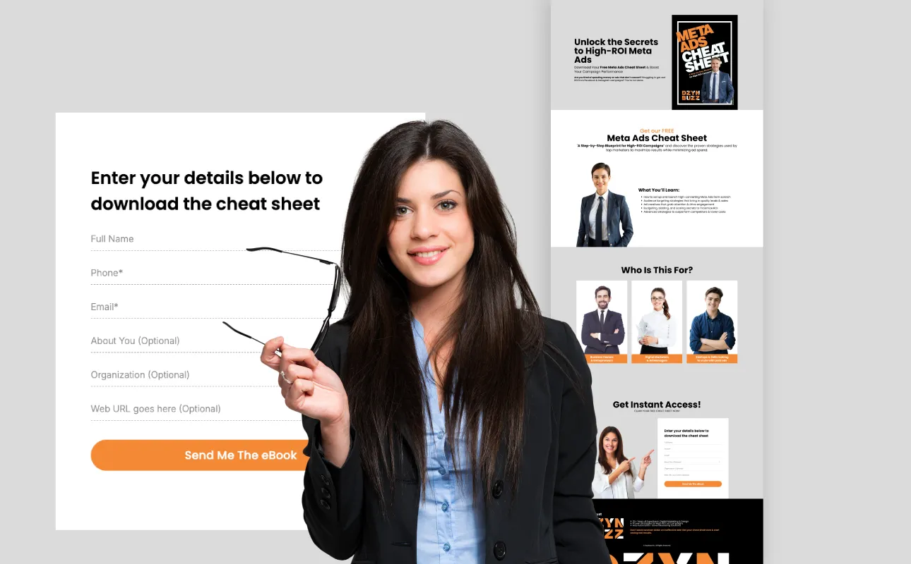
6. Lead Capture Form Design
Forms are often the main conversion goal. Make them frictionless:
- Ask only for essential info (Name + Email works for most cases)
- Use smart labels inside the field
- Add privacy reassurance below the form (e.g., “We’ll never spam you.”)
- Consider multi-step forms for higher-value conversions
Fact:
Every additional form field can reduce conversions by up to 11%.
7. Visual Hierarchy and Layout
Design shouldn’t just look good—it should guide the eye:
- Use contrast and spacing to separate sections
- Apply bold fonts for headings, soft fonts for body
- Emphasize key elements like CTA and testimonials with color blocks
- Keep a consistent color scheme (brand alignment builds trust)
At DzynBuzz, we recommend using your brand’s primary action colour (like #f48935) for CTA buttons and link highlights.
8. Mobile Responsiveness and Load Speed
More than 60% of landing page traffic is mobile. Your page must:
- Load in under 3 seconds
- Be scroll-friendly with touch-optimized buttons
- Avoid popups that disrupt the experience
- Display forms and visuals cleanly
Google data shows that pages loading in 5 seconds see 35% lower bounce rates than slower pages.
9. Exit-Intent and Retargeting Strategy
Not every visitor will convert right away. Add layers to recapture them:
- Exit-intent popups (e.g., “Wait! Get 10% off if you stay…”)
- Retargeting pixels from Facebook, LinkedIn, or Google
- Email nurturing workflows for leads that didn’t convert
10. Final Reinforcement Section (The Closer)
The last section should reconfirm your core message:
- Quick benefit recap (bulleted list)
- Short testimonial or quote
- Final CTA
Example:
Ready to grow your leads?
Start using our AI-powered landing page builder today. No credit card required.
Related Blogs: Landing Page Series
- What Is a Landing Page? And Why It’s Essential for Your Marketing Funnel
- Anatomy of High Converting Landing Page
- Designing for Conversion – UX/UI Best Practices for Landing Pages
- Words That Convert, Crafting Powerful Copy for Landing Pages
- From Visitors to Leads: Lead Magnets for Creating Irresistible Offers for Your Landing Pages
- Lead Capture Forms: What to Ask, What to Avoid for Better Conversions
- A/B Testing Your Landing Pages: What, Why, and How to Optimize
- What Happens After the Click? Integrating landing pages with CRM
- Driving Traffic to Landing Pages: SEO, Ads, and Social Media Tactics
- Landing Page Mistakes to Avoid in 2025 (+ Future Trends in Lead Gen)
Final Thoughts
Creating a high-converting landing page isn’t about flashy design—it’s about thoughtful structure, user psychology, and value-driven communication. By following this proven anatomy, your pages can go from overlooked to unstoppable.
“Every section should have one job: move the user closer to conversion.”


