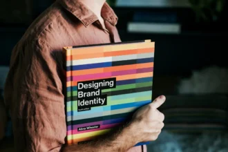
Did you know 90% of snap judgments about products are based on colour alone (University of Winnipeg)? In design, colours don’t just look pretty—they trigger emotions, shape perceptions, and drive actions. Whether you’re designing a website, ad, or app, understanding colour psychology can dramatically improve engagement. Here’s how to use it strategically.
1. How Colour Impacts Decision-Making
Key Stats:
- 85% of shoppers say colour is the primary reason they buy a product (Kissmetrics)
- Colour increases brand recognition by 80% (Rebrand)
- Red “Buy Now” buttons outperform green by 21% (HubSpot)
2. What Different Colours Communicate
| Colour | Psychological Effect | Best For |
|---|---|---|
| 🔴 Red | Urgency, excitement | Sales, CTAs, food brands |
| 🔵 Blue | Trust, security | Finance, tech, healthcare |
| 🟢 Green | Growth, health | Eco brands, wellness |
| 🟡 Yellow | Optimism, attention | Discounts, warnings |
| ⚫ Black | Luxury, sophistication | High-end products |
| 🟣 Purple | Creativity, royalty | Beauty, spirituality |
3. Data-Backed Colour Strategies for Conversions
A. Use Red or Orange for CTAs
- Red buttons convert 34% better than others (NN Group)
- Example: Netflix’s red “Sign Up” button
B. Blue for Trust (Especially in Finance)
- 48% of banks use blue in logos (Colour Meanings)
- Example: PayPal, Chase
C. Green for Eco-Friendly Messaging
- 78% of consumers associate green with sustainability (Nielsen)
- Example: Whole Foods’ branding
D. Black for Luxury & Exclusivity
- Luxury brands using black see 25% higher perceived value (Journal of Marketing)
- Example: Chanel, Mercedes-Benz
4. Cultural & Gender Differences
Men vs. Women Preferences:
- Men prefer bold colours (blue, black, green)
- Women favor softer tones (purple, pink, pastels)
Cultural Meanings Vary:
- White = purity (Western) vs. mourning (Eastern)
- Red = luck (China) vs. danger (USA)
Pro Tip: Research your target audience’s cultural associations.
5. A/B Test These Colour Combos
| Goal | Winning Colour Pair |
|---|---|
| Increase trust | Blue + white |
| Boost urgency | Red + yellow |
| Eco-friendly appeal | Green + brown |
6. Common Colour Mistakes to Avoid
- Using too many competing colours (stick to 3 max for clarity)
- Ignoring contrast (low contrast = 40% higher bounce rate)
- Choosing colours based on personal preference vs. data
7. Tools to Help Pick the Right Colours
- Coolors.co (generate palettes)
- Adobe Color (extract colours from images)
- ColorZilla (analyze colours on any website)
Final Takeaways
- Red & orange drive action (best for CTAs)
- Blue builds trust (ideal for finance/ tech)
- Cultural context matters (adapt for global audiences)
- Always A/B test (what works for one brand may not for another)
Want to see colour psychology in action? Check how major brands like Coca-Cola (red) and Facebook (blue) use it strategically!

