In a world where over 70% of digital interactions happen on mobile, mobile UX design principles are no longer optional, they’re foundational. While designing for a mouse pointer used to be the standard, today’s users are tapping, swiping, and pinching their way through digital experiences. If you’re still designing with cursors in mind, you’re probably ignoring key principles of mobile-first UX—and it could be costing you traffic, conversions, and customer trust.
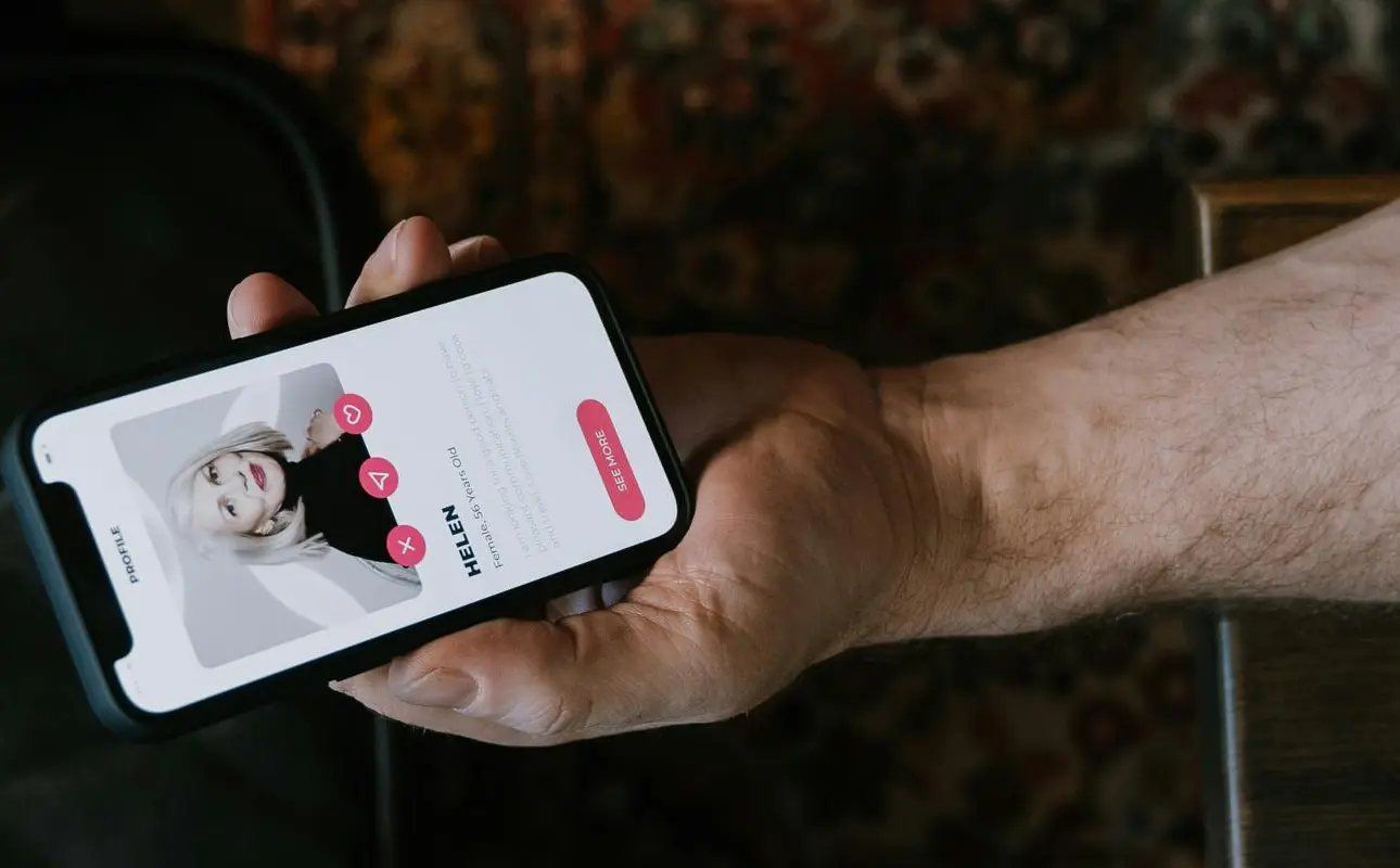
What Does It Mean to Design for Fingers?
Designing for fingers means creating user interfaces that accommodate touch gestures, not clicks. Unlike a mouse cursor, which can click with precision, fingers are thicker and less accurate. That means mobile UX design must offer:
- Larger tap targets
- Adequate spacing between elements
- Simpler, intuitive navigation
Your user isn’t carefully clicking—they’re quickly tapping on the go. Your design needs to reflect that.
Why Mobile UX Matters More Than Ever
According to Statista, over 58% of global web traffic comes from mobile devices. And with Google now using mobile-first indexing, how your website performs on mobile can directly impact your search rankings.
Poor mobile UX leads to:
- Frustrated users
- High bounce rates
- Missed conversions
- Damaged brand perception
Mobile UX Rules You’re Probably Breaking (and How to Fix Them)
Here are some common mistakes—and how to avoid them:
1. Tiny Tap Targets
If users struggle to tap buttons or links, they’ll leave.
Fix it: Make all interactive elements at least 44×44 pixels, as recommended by Apple and Google.
2. Cluttered Design
Trying to cram everything into a small screen overwhelms users.
Fix it: Embrace white space. Prioritize essential content. Use collapsible menus and progressive disclosure.
3. Hover-Dependent Features
Hover works on desktop—not on touchscreens.
Fix it: Replace hover effects with tap-friendly alternatives like toggles, tabs, or expandable sections.
4. Navigation That’s Hard to Reach
If users can’t reach navigation with their thumb, it breaks the flow.
Fix it: Keep key actions within the thumb zone—the area easily reachable with one hand.
5. Unresponsive Gestures
Relying too heavily on advanced gestures can confuse users.
Fix it: Stick to standard gestures like tap, swipe, scroll, and pinch. If using custom gestures, provide clear guidance.
6. Slow-Loading Pages
Mobile users are impatient. A delay of just one second can hurt conversions.
Fix it: Optimize images, use fast hosting, and consider AMP (Accelerated Mobile Pages) for content-heavy sites.
When Did the Shift Begin?
The mobile-first revolution began with the launch of the first iPhone in 2007, which introduced multi-touch functionality. Since then, touchscreens have become the norm across smartphones, tablets, and even laptops—transforming how we interact with digital content.
Where This Applies
You need to think finger-first across:
- Websites
- Mobile apps
- E-commerce platforms
- Online forms
- Interactive menus
- Navigation bars
- Checkout processes
Basically, if it lives on a screen and might be touched, it needs to be designed accordingly.
The Future of Finger-First Design
As technology evolves, so do user expectations. We’ll see more:
- Foldable screens that change layout needs
- Touchless gestures (via motion sensors or cameras)
- Voice-first interfaces (where tap complements voice)
- AI-driven personalization based on device behavior
Yet, for the foreseeable future, touch remains the primary interface—so finger-first design isn’t going away. It’s only becoming more important.
Related Read : Design Systems: Building the Future of Scalable, Consistent Digital Experiences
Why You Need to Start Now
Designing for fingers isn’t just about aesthetics—it’s about usability, accessibility, and performance. In today’s competitive digital landscape:
- User-centric design = more engagement
- Better usability = higher conversions
- Mobile optimization = better SEO
By shifting your mindset from cursor to fingertip, you ensure that your digital experience works for real-world users—not just for your design mockups.
Final Thoughts
It’s time to break the old rules and embrace new ones. If your mobile experience feels like a shrunk-down version of your desktop site, you’re not doing it right. Design with fingers in mind, and your users will thank you—with longer visits, more conversions, and greater brand loyalty.
Featured image source pexels.com

