Choosing brand colours isn’t just about aesthetics – it’s a science rooted in colour psychology. Your palette can subconsciously shape how users perceive your brand’s personality, trustworthiness, and value. But if the message your colours convey doesn’t align with your actual brand promise, it could silently cost you user trust and conversions.
Why Colour Psychology Matters in Branding
Colours are emotional triggers. According to research, up to 90% of initial judgments about products can be made based on colour alone.
| Colour | Common Perception | Brands Often Using It |
|---|---|---|
| Blue | Trust, Stability | Facebook, LinkedIn |
| Red | Passion, Urgency | Coca-Cola, Netflix |
| Green | Growth, Health | Spotify, Whole Foods |
| Yellow | Optimism, Youthfulness | Snapchat, McDonald’s |
| Black | Power, Sophistication | Apple, Chanel |
Your brand may unknowingly be sending mixed signals if your colour scheme doesn’t match your tone or audience expectations.
The Trap: When Colours Work Against You
Let’s say you run a fintech startup. If your branding leans heavily into reds and oranges, users may subconsciously associate your service with urgency or instability – dangerous traits in finance.
Or imagine a wellness brand using stark blacks and greys. You may appear cold or clinical rather than warm and healing.
“Colour misalignment is one of the most overlooked branding pitfalls – and it’s purely psychological.”
Tips for Using Colour Psychology Effectively
1. Understand Your Brand Archetype
Is your brand a caregiver, rebel, or innovator? Each archetype aligns with different colours.
2. Limit Your Palette to 2–3 Primary Colours
Too many colours dilute brand clarity. Stick to a defined core and use accents sparingly.
3. Consider Cultural Contexts
Colours have different meanings globally. Red symbolizes luck in China, but warning in the West.
4. Test in Digital Interfaces
Colours behave differently on screens than in print. Test across devices for consistency and legibility.
Why DzynBuzz Chose Orange: The Psychology Behind Our Brand Colour
Orange is not just a visual accent for DzynBuzz – it’s a deliberate choice that symbolizes energy, creativity, and enthusiasm. These traits align with our mission to energize businesses through intelligent design and marketing innovation.
In colour psychology, orange evokes action, confidence, and warmth – making it a perfect fit for a brand like DzynBuzz that stands at the intersection of strategy, creativity, and technology.
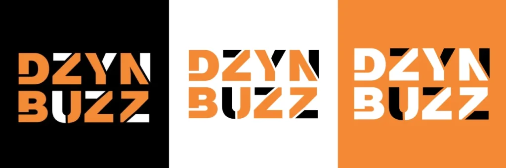
Our visual identity is a promise: bold thinking, dynamic solutions, and an ever-curious approach to design and digital growth.
Case Study: Calm vs. Headspace
- Calm uses blues and gradients to evoke peace, sleep, and trust.
- Headspace uses warm oranges and whites – cheerful, energizing, and youth-friendly.
Both are in the same space—yet their colour psychology communicates entirely different emotional positions.
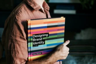
Featured image source pixels.com